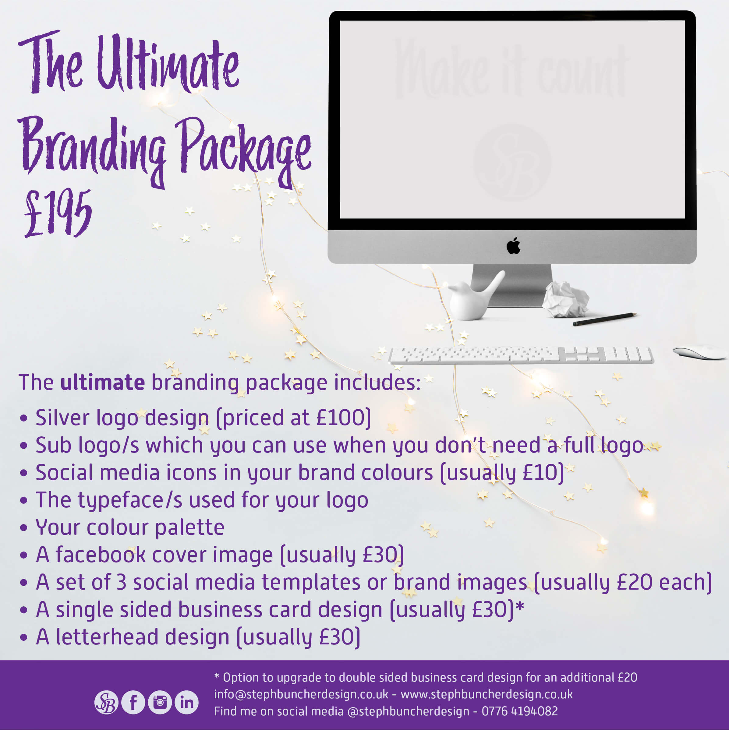
Using a typographic hierarchy method would focus on each part of the design in order of importance. For example, in an advert this would start with the name of the product, then the price, and then the general information. The product name would usually be the most important element, possibly in an eye catching or bolder font, and usually larger than the rest of the text. The next element would usually be the price, maybe in a different colour, or held within a shape, set apart from the main body of text to ensure it stands out. Then the body of text, usually in a plainer font that is easy to read, especially if a script font has been chosen for the product name. This text would also be at a smaller size. Finally, at the bottom would be the company information, possibly smaller again and maybe differentiated from the main body of text by colour or by placing it within a coloured band or below a line etc.
Of course not every advert or design fits these rules but it’s generally a good place to start.
Here's an example of one of my adverts where you can see how a hierarchy is used to make the text work and get the message of the product/service and price across clearly: