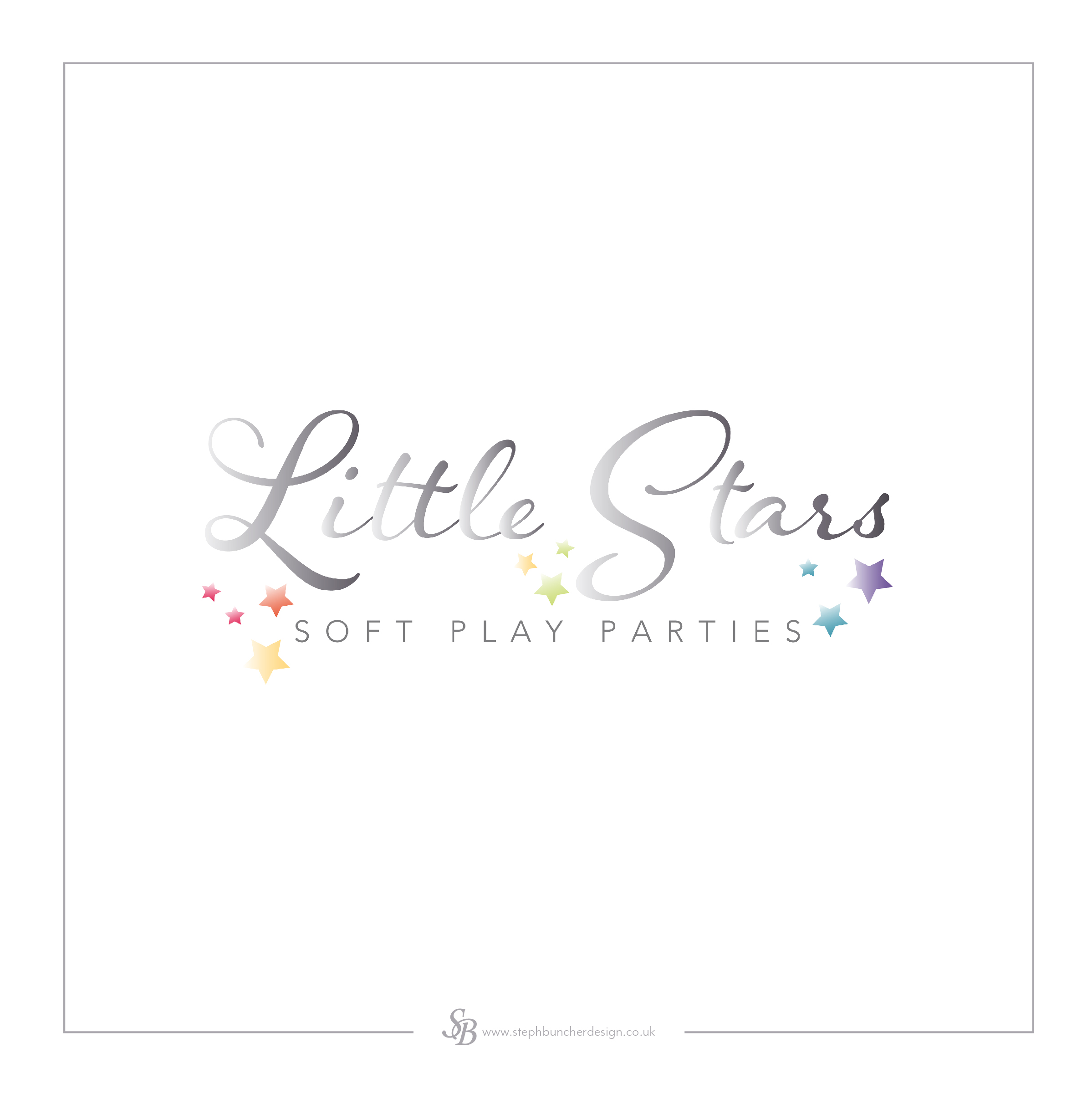
The combination of fonts can be used to separate the business name with the tagline or description below it. As well as in logo design, this is also something to consider in an advert, poster or flyer design, where you want to ensure certain words or lines of text stand out, or to just create interest in a design. Here's another example:
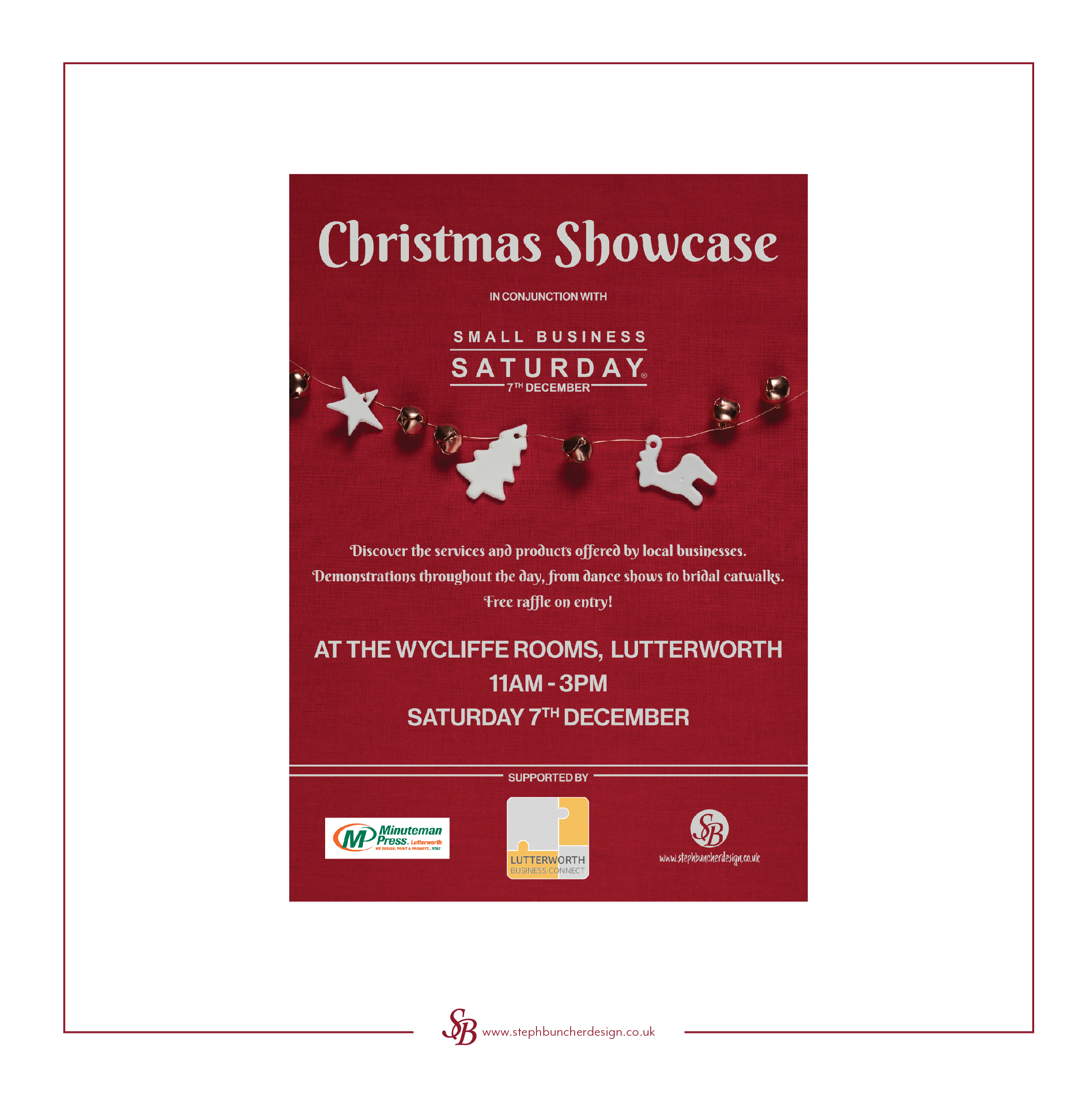
Unless you're designing something where a variety of fonts would achieve your message, like a typographic word art image, it's usually best to stick to just a couple of fonts. Experiment with the fonts you have in the software you’re using, or have a look at downloading some new free fonts from reputable websites. I use Adobe Fonts which are included in my Creative Cloud subscription, but occasionally I find a font I need on sites such as Font Squirrel or 1001 Fonts (please be sure to be very careful when downloading anything from the internet and don't download anything that doesn't look right or comes up with an error or warning message, even from these sites or a site that you've used previously).
As always, if you need any help or advice, I'm always happy to have a chat, get in touch at info@stephbuncherdesign.co.uk
