‘Type’ is the term for everything that goes into the text. It originally meant the actual letters made out of metal or wood that were used in a printing press.
‘Typography’ is the style and appearance of text. If you’ve got children you’ll have come across great examples of typography in children’s books, the first that spring to my mind are the ‘Charlie and Lola’ books by Lauren Child, where the text of the story is arranged to create patterns.
‘Typeface’ or ‘font family’ is a set of letters to include the whole alphabet, plus symbols, which all match and have similar features. For instance, Times and Arial are typefaces/font families.
The ‘font’ is the style of a typeface, you’ll often notice different words/names after the main typeface name, so within the Arial font family, for example, you’ll find Arial, Arial Black, Arial Narrow & Arial Rounded.
How do I choose?
Choosing the right font is important as it is part of your brand identity and image. It also helps to set the tone of a piece of text. The font you choose can help people to understand your message before they’ve even read the actual words. You should also make sure you choose a font that’s easy for your audience to read.
Serif or Sans Serif?
The two main font styles are ‘Serif’ and ‘Sans Serif’. The serif is the small line at the end of a stroke on a letter, some fonts have these and some don’t.
Arial is a sans serif font.
Times is a serif font.
The main text, or body copy of your article/poster/flyer etc is fine in both serif or sans serif. The main thing is to ensure that you choose one that’s legible/readable, often sans serif fonts can be easier to read. Choosing a serif font can give your copy more of a formal feel, whereas a sans serif font often looks more modern.
Should I use a different font for the title?
Display or header fonts are more eye catching and great for titles or a main call to action or message. Script, handwritten or decorative fonts are fab for this and again can really show off the style of your brand and the message you’re going for. You may choose to tie this in with a font used within your logo itself, so that your main titles or messages match your company name. You don't have to use a different font for a title though, often increasing the size or weight (making it bold) can do a great job too.
How many fonts should I choose?
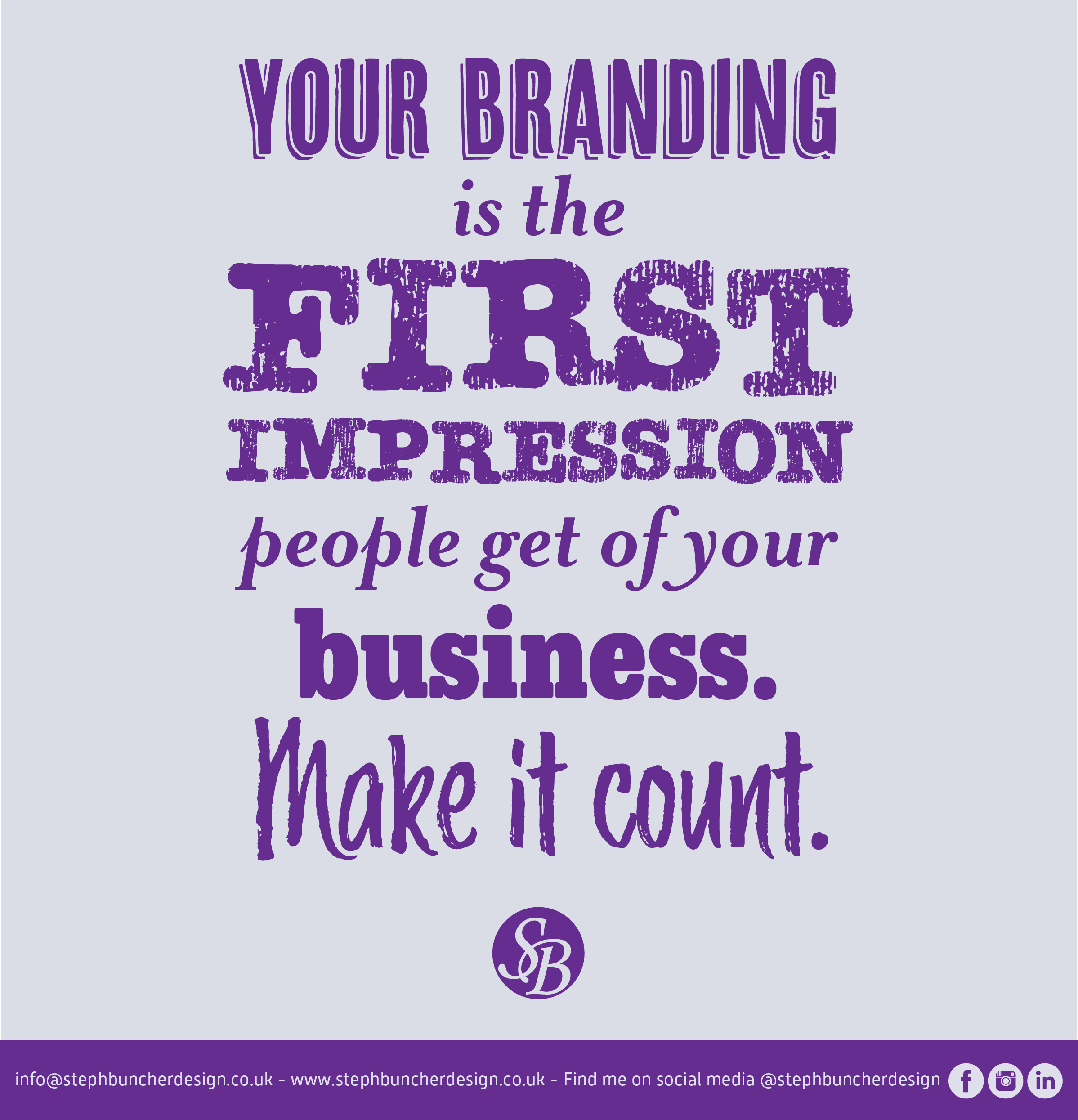
Usually choosing 1-3 font is plenty, however you may choose more to make a statement like the message I use below to convey the importance of good branding!
If you have any questions or would like to run anything by me, please just drop me a message!