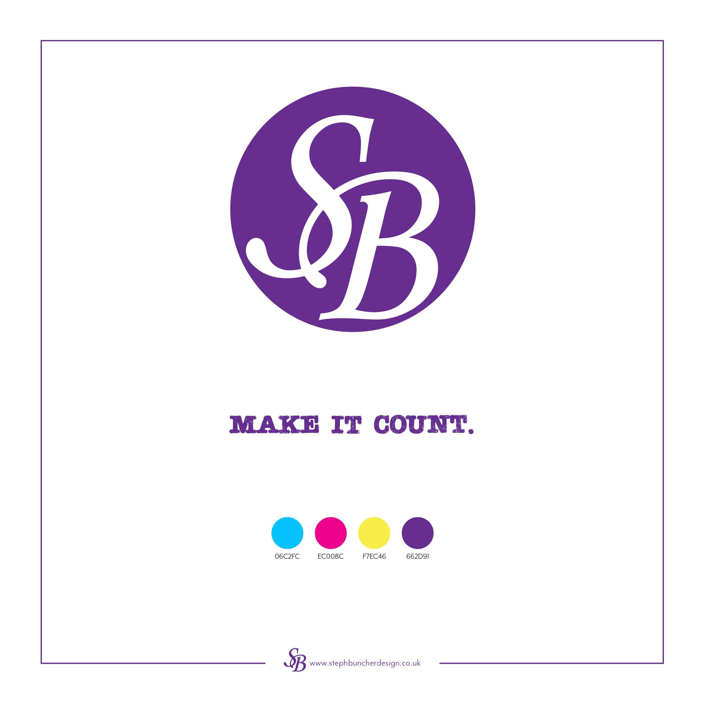
I've been in business for a year now and my logo and branding are more established and recognised, I've spoken to people who I've then handed a business card and they've said "Oh yes, I recognise your logo" which is fab! So this week I've added some brights to my colour palette, going for the three colours used in printing: cyan, magenta and yellow, to complement my SB purple.
I've also swapped to a new typeface to complement the style these colours bring, this is called Teeshirt-Regular and is a bit funky, modern and eye catching. It's only available in capitals though, so wouldn't be a good choice for all of my branding, but it's nice to mix things up a little.
Here's a little peek at my new Spring branding incase you've missed it:
If you'd like to chat and get some advice on doing similar for your business, or if you'd like me to do the hard work for you, feel free to drop me a message or get in touch via the contact form on my website, I'd love to hear from you.
